Recherché is a web app that provides users with a uniquely curated selection of one of a kind designer homes, focusing on their outstanding architecture.
More About My Role:
For this project, I was presented with a project brief, including the finished UX research with its user personas and stories, leaving me in charge of the UI design aspects for Recherché. From creating respective user flows to creating a cohesive, meaningful design that provides clarity, functionality while showing esthetic appeal. I created all major deliverables.
The Challenge -
Designing A Unique Real Estate App Within 2 Months, Solo
When I received the project brief I also knew that the deadline to submit my designs is only less than two months away and all that as a one person team.
In order to stay on track and work efficiently, I had to stay hyper focused on the message and essence this new service stands for and creating a design language that conveys that.
Additionally, concentrating on the presented user flows and the according user flows and meticulously following those in my wireframes and prototypes helped me to successfully deliver a thorough, functional, polished, and pixel perfect prototype and design.
User Stories and Flows:
For this project, the brief included the following user stories:
As a user,...
... I want to create a profile containing all my property criteria, so that I am recommended results most relevant to me.
... I want to be able to search and filter properties, so that I can find good matches based on my needs.
... I want to be able to save or mark properties I am interested in, so that I can easily revisit them.
... I want access to as much written and visual information as possible about properties I’m interested in, so that I can make an informed decision.
... I want to be able to contact the right people if I am interested in viewing a property, so that I schedule a viewing.
In response to these user stories I developed the following user flow diagram:
Low-Fidelity Wireframes
In close reference to the user flow I went ahead and grabbed my iPad to get started on sketching my first wireframes:
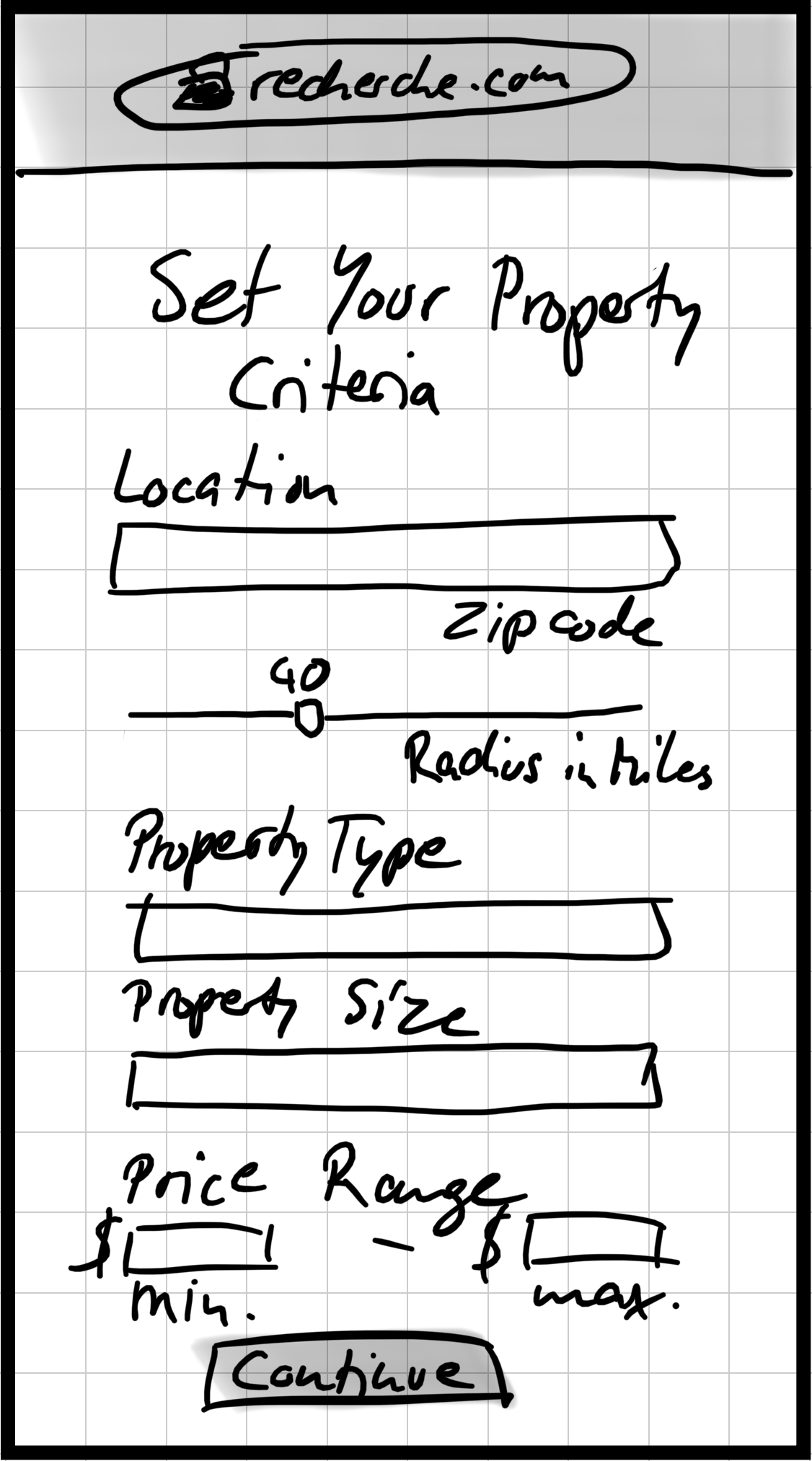
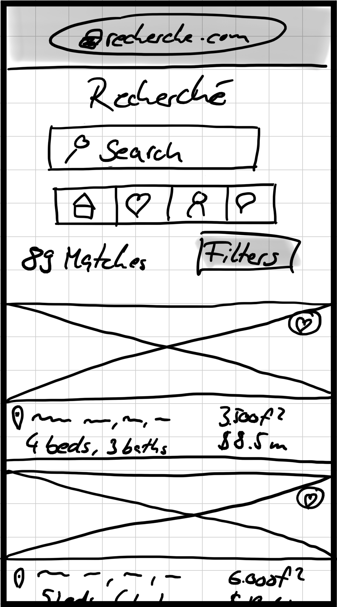

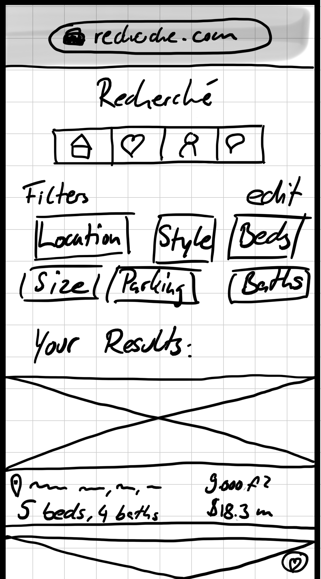

From left to right: Setting up user's property preferences, view relevant properties, refine search with filters, view filtered results, view selected listing detail page
Mid-Fidelity Wireframes
To move forward and develop mid-fidelity prototypes I had to think about what direction the design language should go. I opted among other things for cards on the search results and a navigation hamburger button for the menu:


From left to right: Setting up user's property preferences, view relevant properties, navigation, refine search with filters, view selected listing detail page
Two Mood Boards
Now, in order to elevate the designs to the next level, it was time to incorporate colors, fonts, imagery, and an overall appealing style to the simple and dry greyscale wireframes. In order to help me and get me inspired created two unique and distinct mood boards to set the direction and vibe I should go for, representing Recherché in the best way possible:
Mood board 1 focuses on the aesthetics of materials used in buildings and their surroundings, hence the color pallet of muted and nature tones with browns (wood, trees), greens (foliage, nature), beige (concrete, rocks). This creates a perfect symbiosis of the information provided and the properties which will generate a cohesive experience overall.
Mood board 2 on the other hand focuses more on a louder color pallet featuring reds and blues which would center the information. This could potentially interject with the products and the focus on architecture and design.
The main attraction of Recherché will of course be the properties themselves, which means that photographs will be the most important aspect.
Therefore, choosing mood board 1 allows for a neutral and natural yet sophisticated and symbiotic appearance that offers the space to let the user focus on the beauty of the properties, and to let the photographs and thus the properties speak for themselves.
Style Guide - Logos, Colors & Icons
This is an excerpt from my style guide for Recherché. Here you can see the logos as well as the icons I created for this web app. I decided to build my own assets to provide a unique and consistent design language. You can access the full style guide here.
High-Fidelity Wireframes
Finally arriving at the final high fidelity wireframes and the prototype, I incorporated the design direction from the first mood board, color pallet, icons and logos. The design language pretty much stayed the same from the mid-fidelity stage, however, I enhanced the spacing by providing more room to allow easier usability and accessibility as well as create a more roomy experience since Recherché also offers spacious properties, so why be restricted during your house hunt?
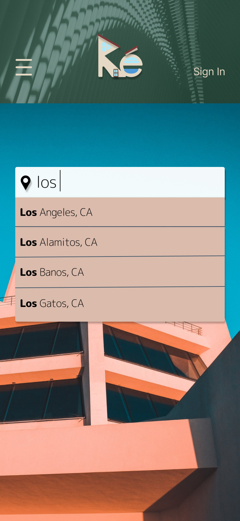
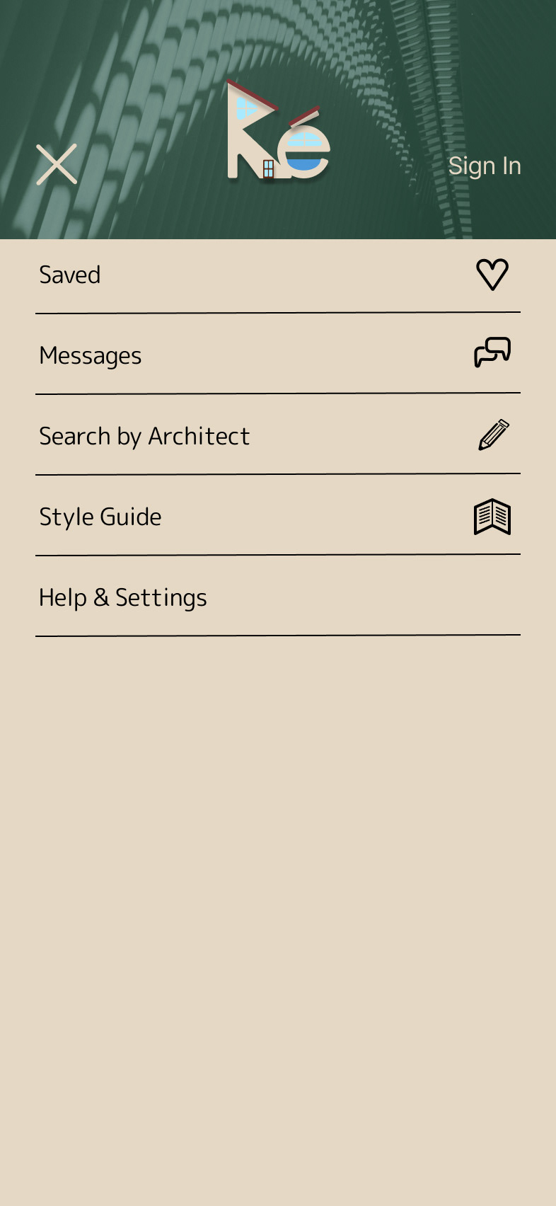

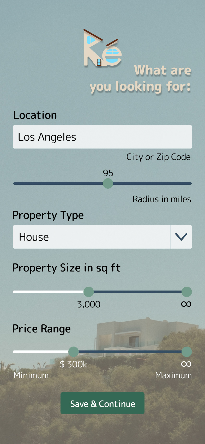


From left to right: Landing page with search function, navigation, sign-up, setting up user's property preferences, view relevant properties, refine search with filters, view selected listing detail page
Animations
For a few transitions I incorporated animations for the full logo to the shortened version as well as the navigation button:
Breakpoints
In order to provide the best experience across devices, I opted for three plausible breakpoints so - extra small devices (smartphones), small devices (tablets), and medium devices (desktop):
Prototype
And here, what I am sure you have been direly waiting for, the finished prototype for Recherché you can see and interact with:
Conclusion & Outlook
The entire experience of creating this one-of-a-kind web app was very insightful and the challenges truly pushed me to work efficiently and helped me stay hyper focused. I was able to deliver a unique, special, functional, and user friendly design that represents Recherché's. It provides all functions that were requested in the brief.
As for next steps, in order to enhance the entire experience, I am planning to incorporate a share option to share listings via a link, as well as a website footer providing quick access to the site map, FAQ section and further details about Recherché such as contact and help.
Thank you for taking the time to check out my process of creating Recherché.
Feel free to reach out for any inquiries.
Have a great day!
Cheers!
JGR