Welcome to my UX and UI Design Portfolio where you can follow my journey of creating an all-new experience to help Musicians elevate their music production skills and ultimately their music overall - and support them putting it out into today's fast-paced music market:
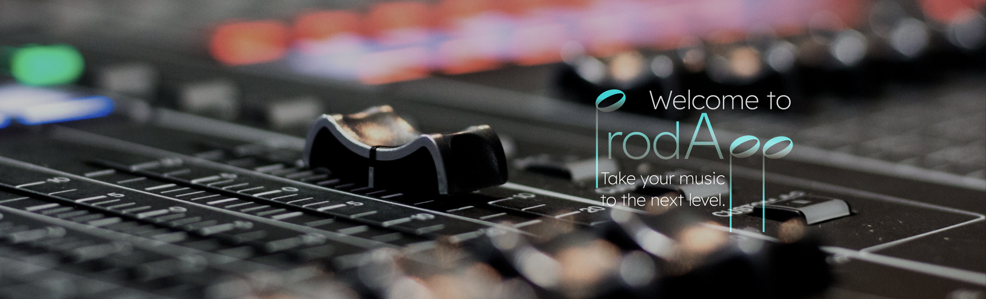
ProdApp
Now, follow me on the design journey, which is based on the design thinking process, to get to the final, high-fidelity prototype of this one of a kind service:
Initial Problem Statement:
Musicians who are in the process of creating music oftentimes need a way that helps and supports them in the different complex stages of producing music because it involves many different high-level tasks that not every person is equally equipped in.
We will know this to be true when we see people use our application and its guidance tools as well as them reaching out to our music and legal professionals and collaborate with them on their new music projects, and ultimately release their new tracks.
We will know this to be true when we see people use our application and its guidance tools as well as them reaching out to our music and legal professionals and collaborate with them on their new music projects, and ultimately release their new tracks.
Chapters in this Article:
I. Research & Empathize
II. Ideate
III. Prototype & Testing
IV. The Final Design
I. Research & Empathize
As I mentioned, since this app will be one of a kind, the competitive analysis and content audit was quickly exhausted due to the lack of direct competition. I focused on the free service BandLab and the paid by project service Tunedly.
Hence, it was easy to position our new experience separate from both, providing individual help for musicians, directly geared towards their specific needs and potential weaknesses during their music making process.
Following the competitive analysis, I focused mostly on qualitative research, as this seems to be the most relevant for the nature of our services. Accordingly, I interviewed a selection of musicians / producers.
My interviewees were open to share many details about their creative processes and moments of getting stuck during those. This helped to establish that there is a versatile need for our services. Furthermore, no person used any app like what ProdApp will be offering.
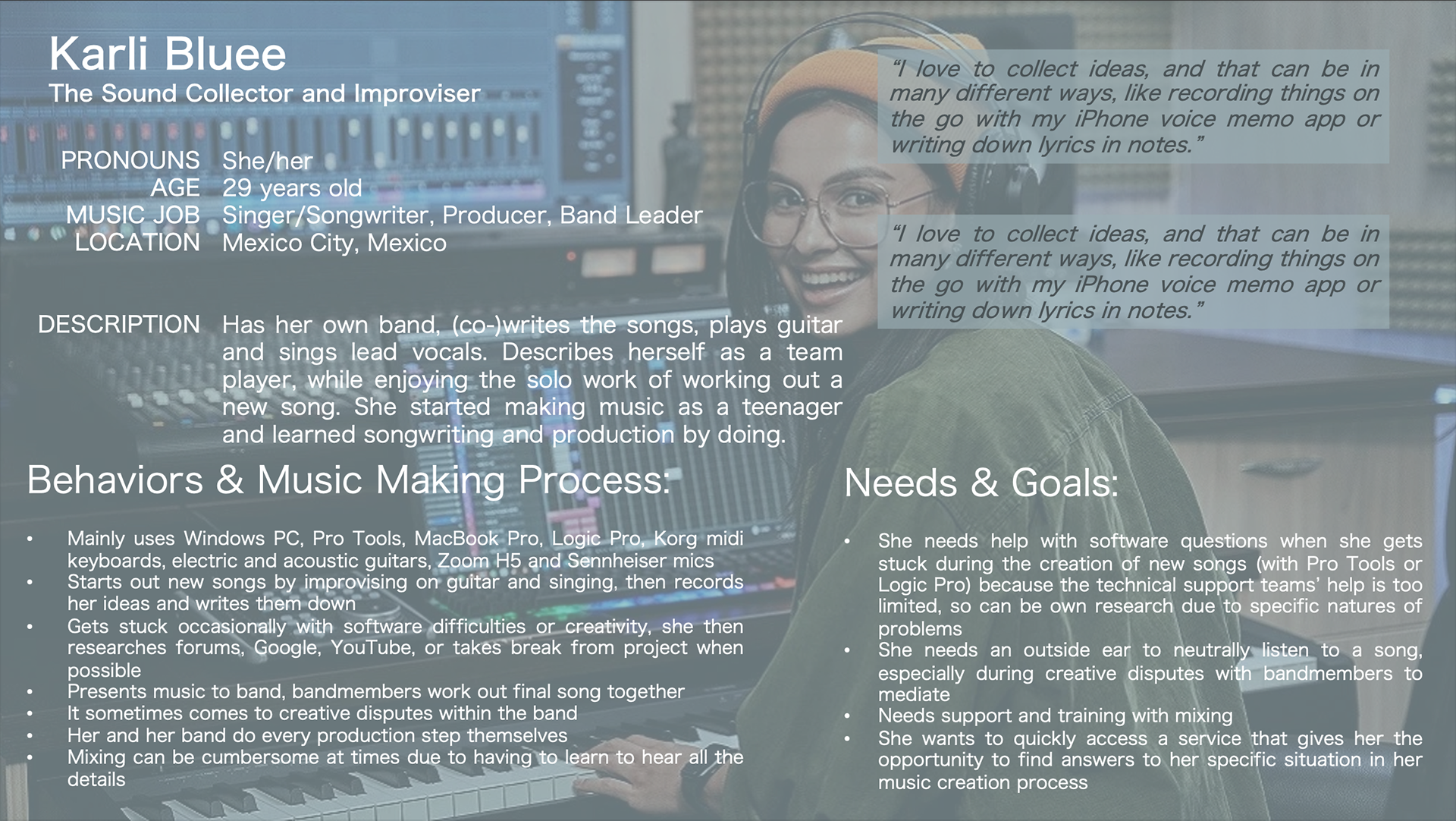
User Personas and Flows:
With the gathered research at hand, I created two user personas that match the findings and user flows will make use of in ProdApp:
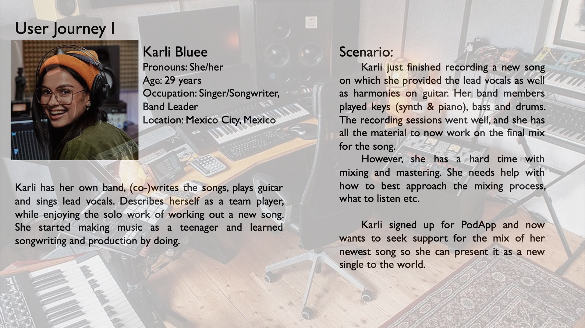
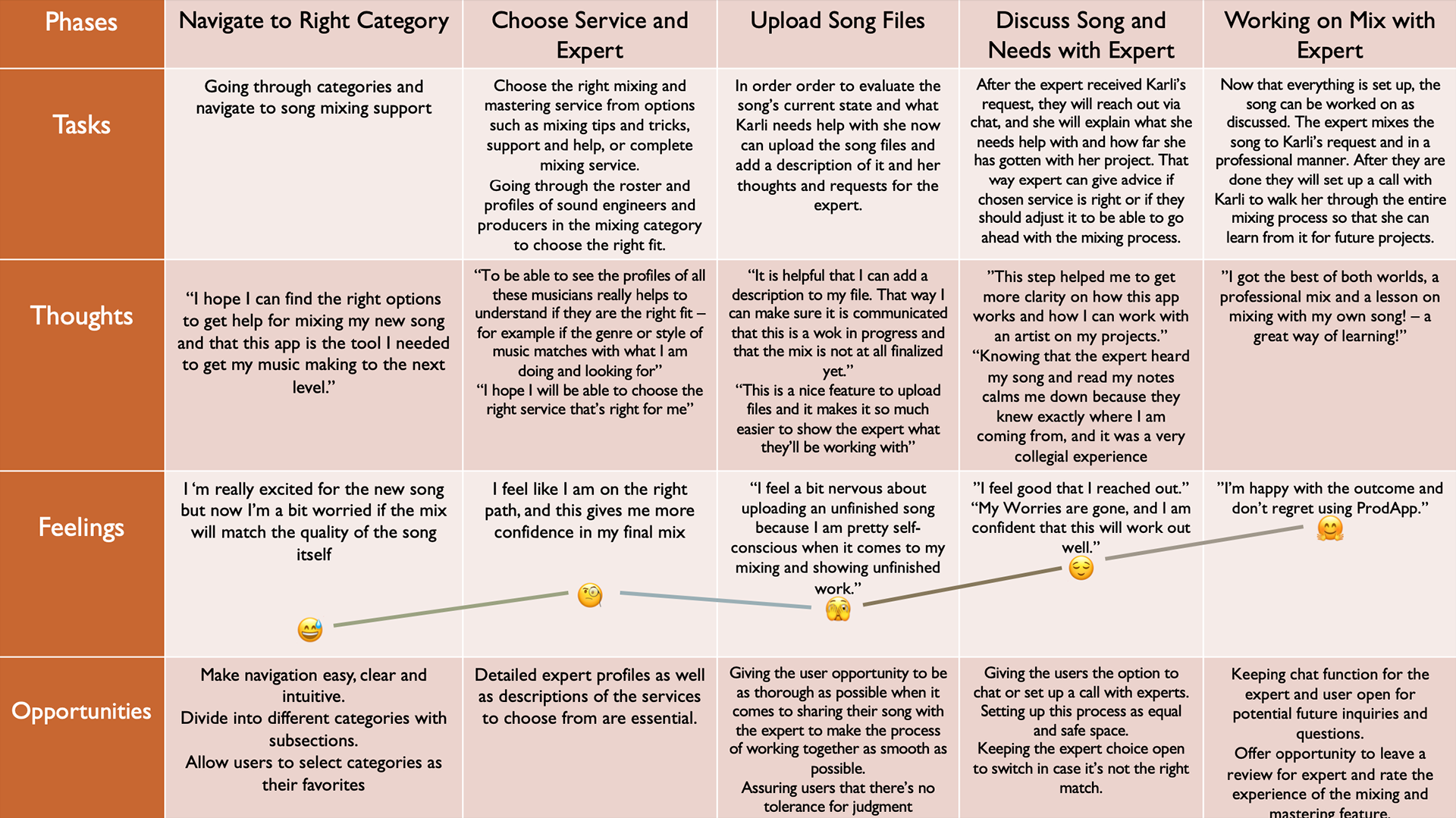
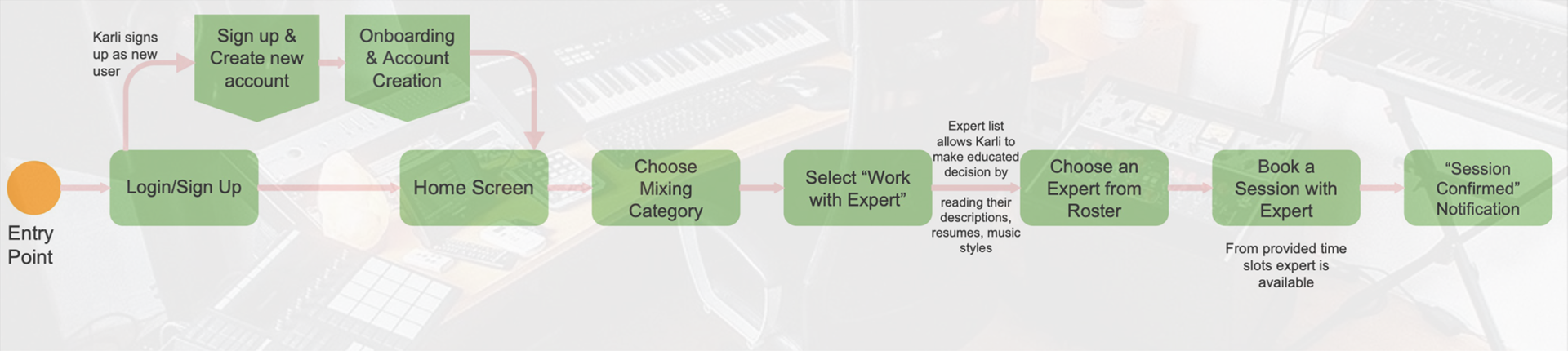
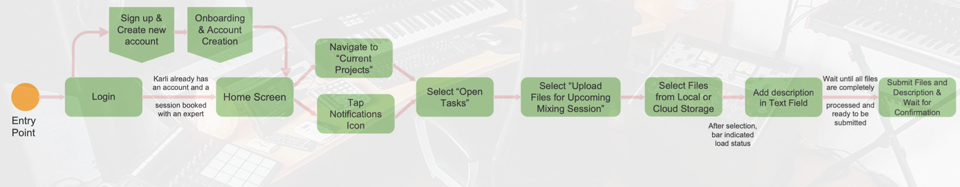
User Persona I and her User Journey
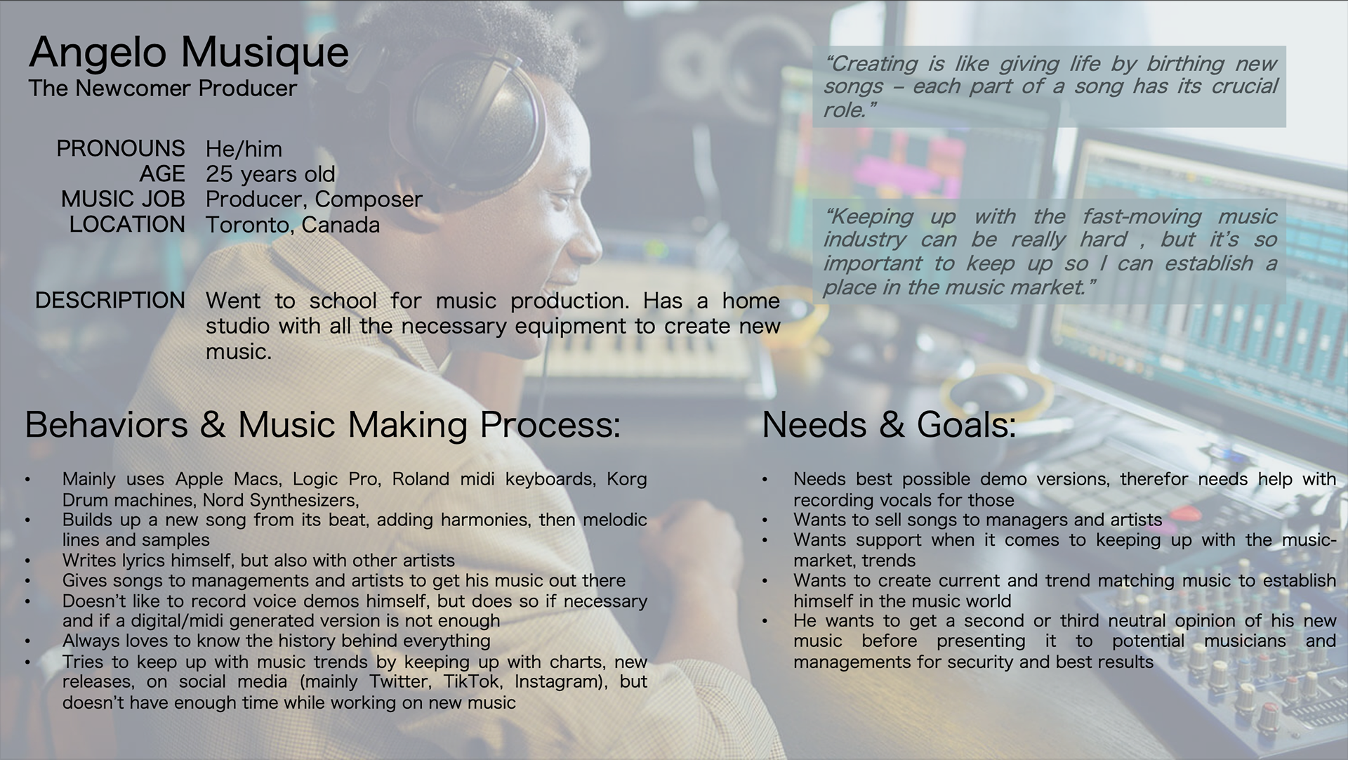
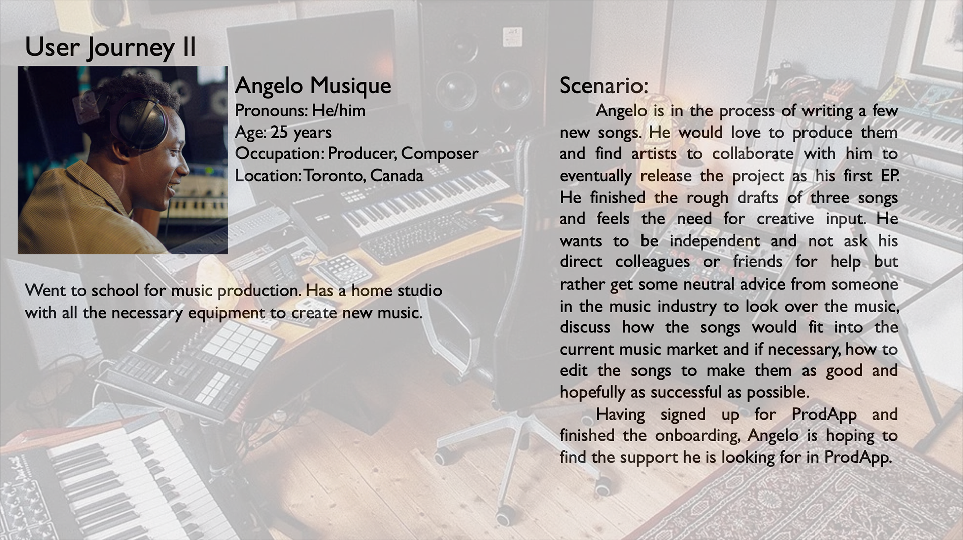
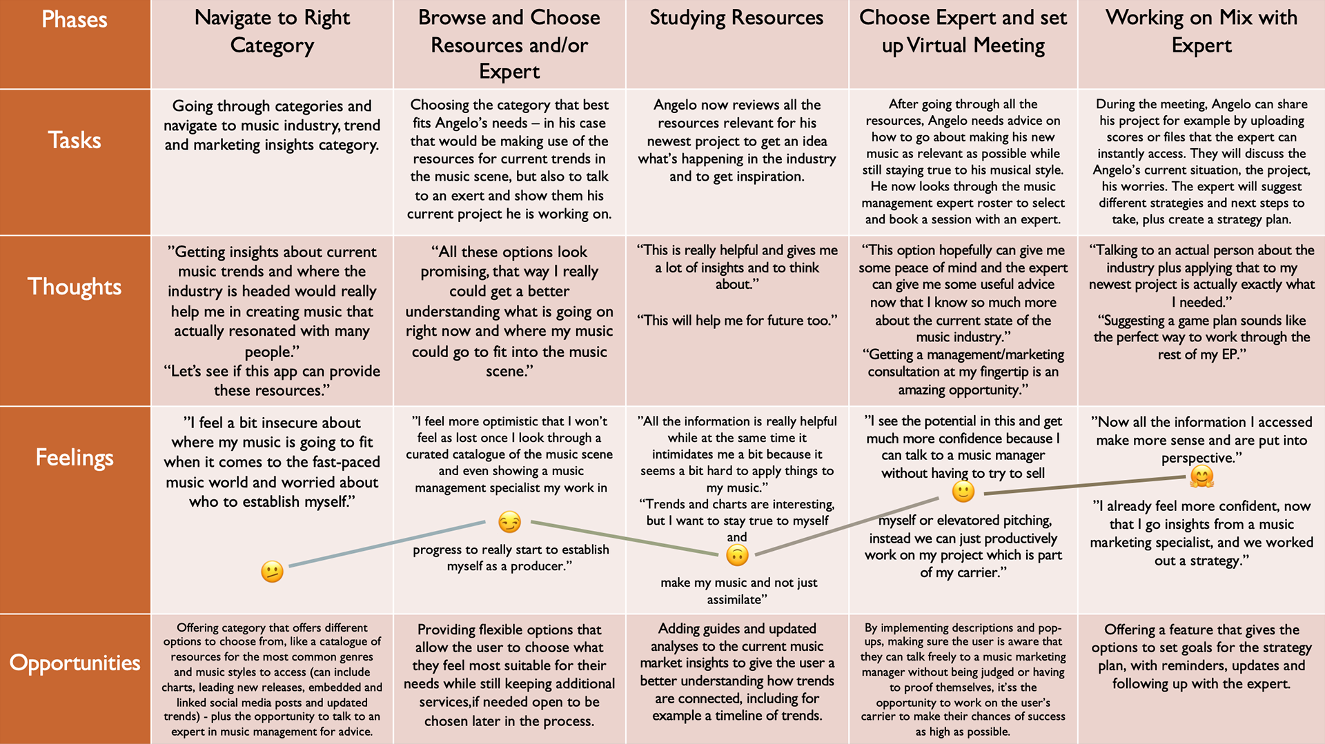
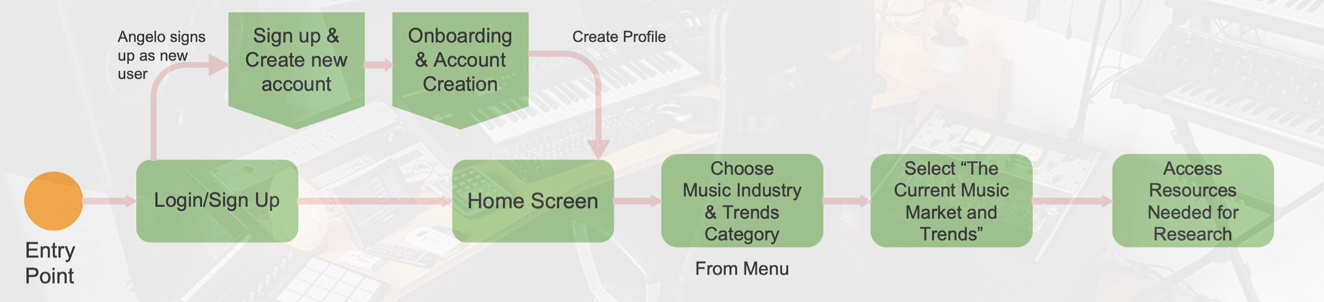
User Persona II and his User Journey
User Flow I
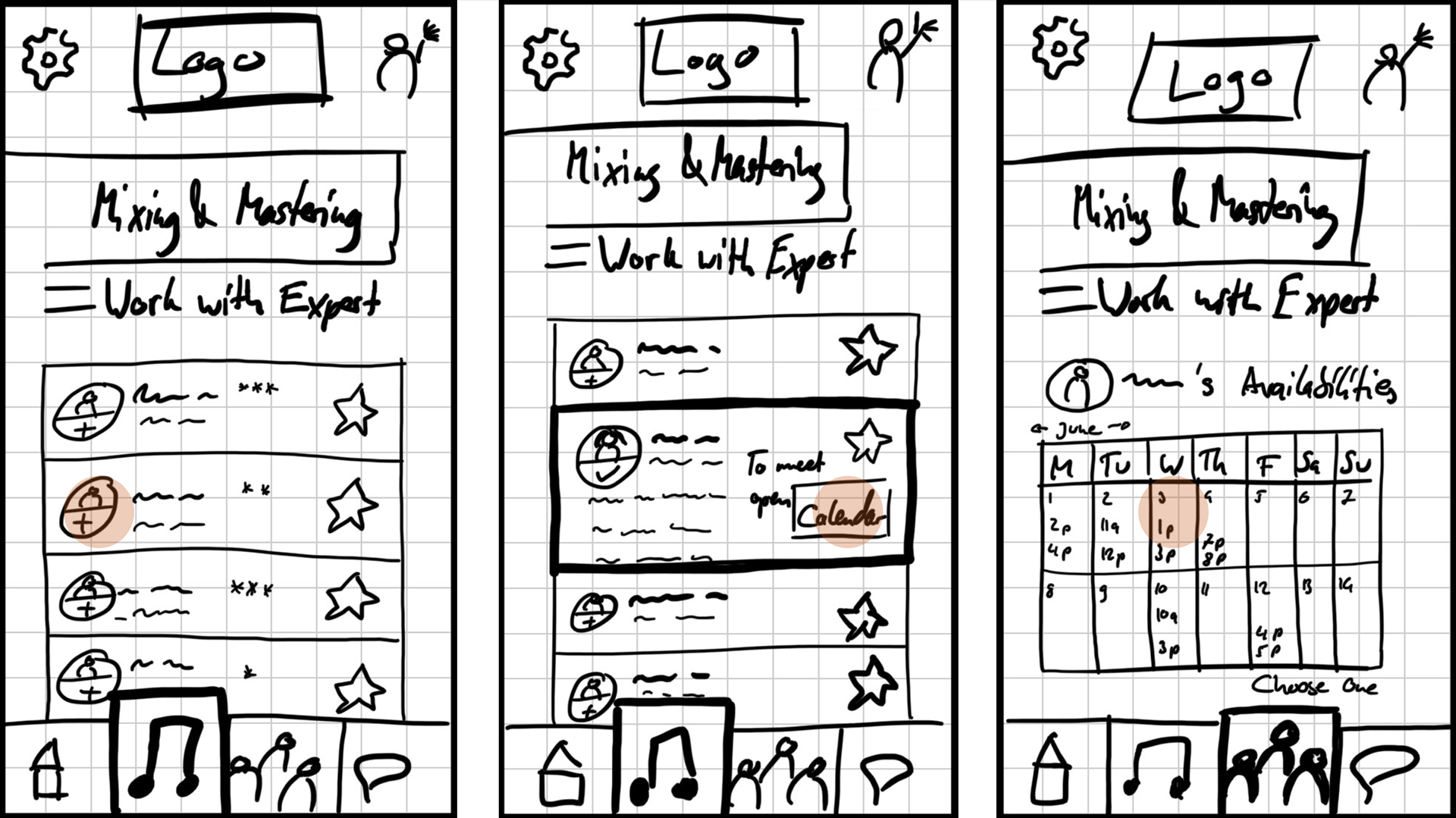
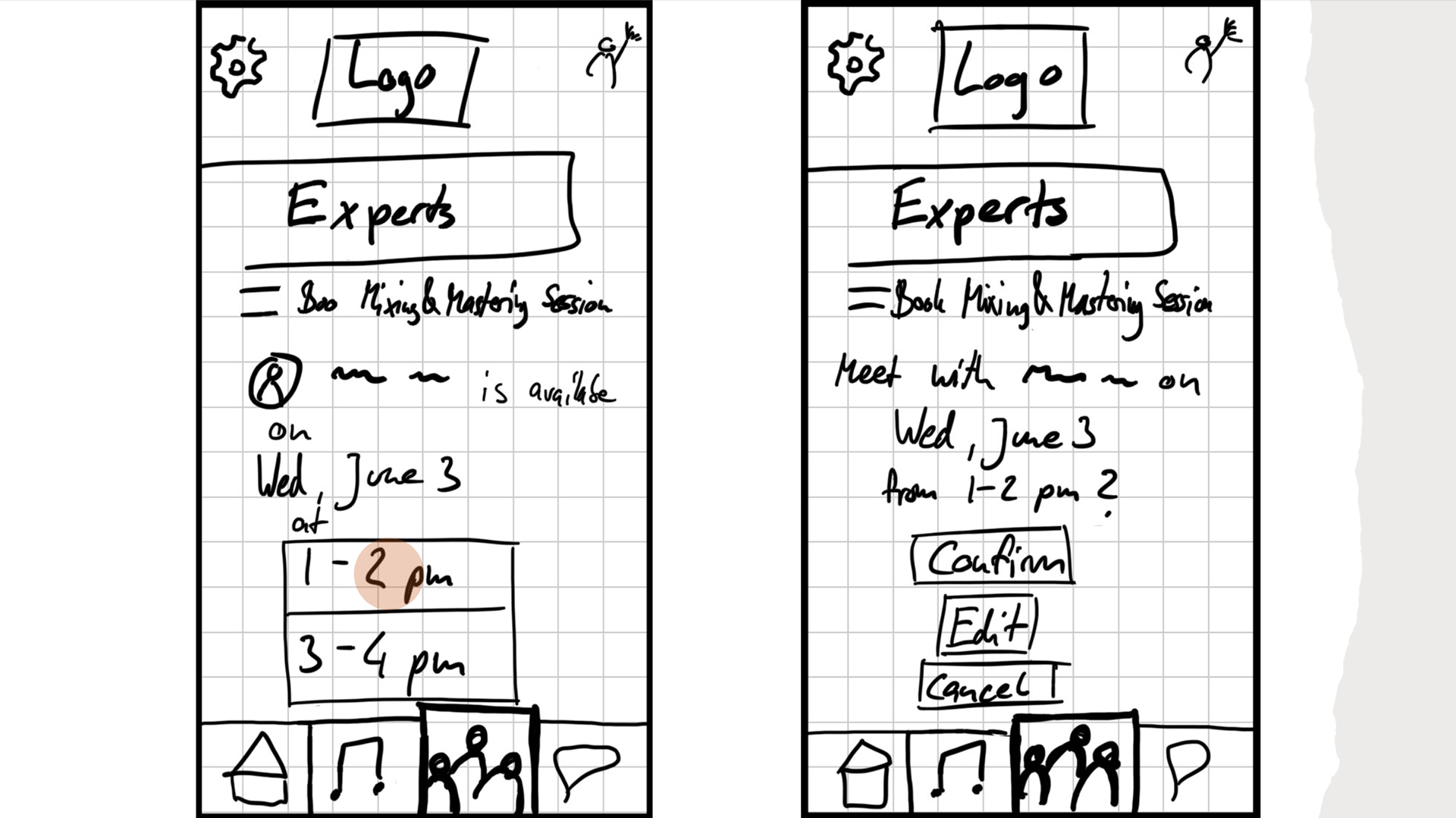
Karli books a session with a mixing & mastering expert
User Flow II
Karli uploads a file to her project
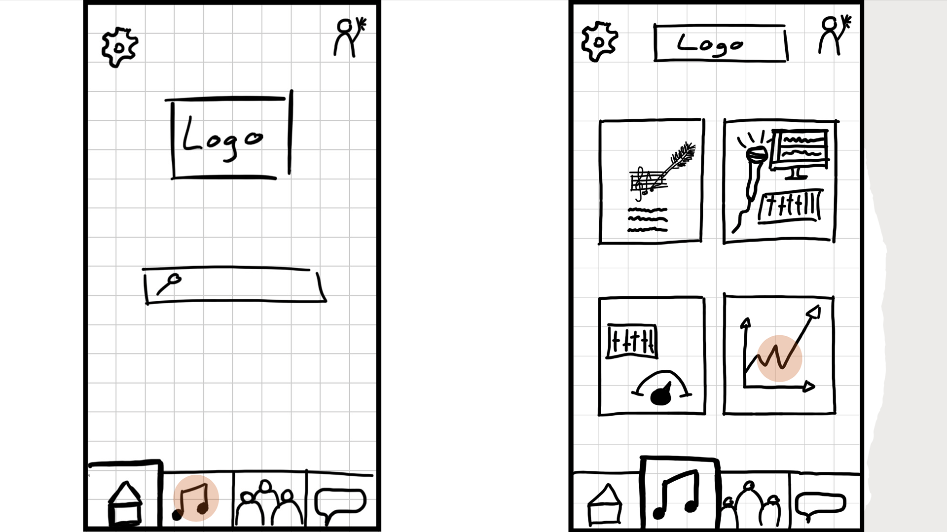
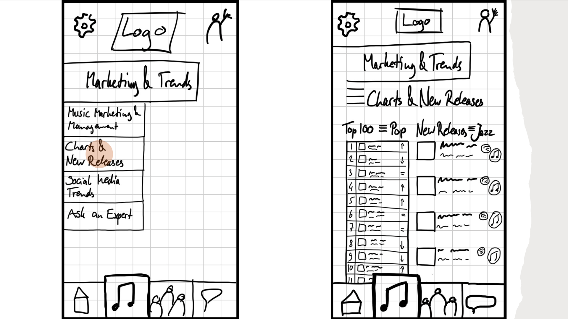
User Flow III
Angelo wants to see whats new in the music industry by looking up charts & new releases
And now we finally come to our wireframes and the iteration process of our future app.
II. Ideate
I conducted an online open card sorting exercise with six participants using Optimal Workshop. The information gathered and analyzed helped me to improve the information architecture for my ProdApp music production support app and website.
I chose 20 updated cards (shown on the left) based on my initial Sitemap which can be seen on the previous slide. All participants sorted the cards into 4-6 categories and labeled those categories.
These are my findings:
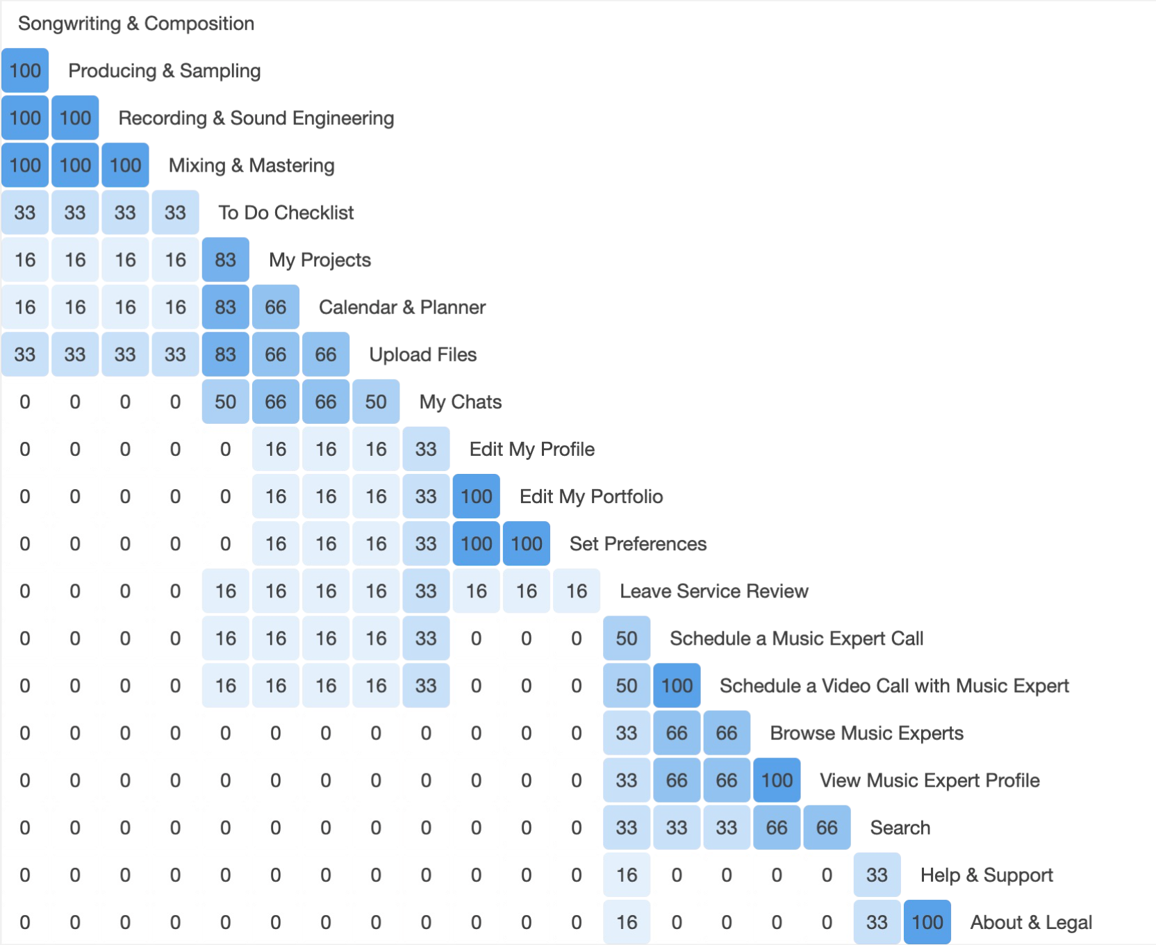
When analyzing the sorting results using the similarity matrix, I noticed strong tendencies of how participants grouped cards and topics together.
The lowest number for only two groupings were at 50 %. Half of the participants grouped “My Chats” and “Upload Files” as well as “Schedule a Music Expert Call” and “Leave Service Review” together. Other match options had significantly lower percentages, which made the decision to group those 50 % matches (also considering what else those cards were matched with otherwise) together easy.
All other groupings had high agreements showing clear categorization tendencies and agreeability.
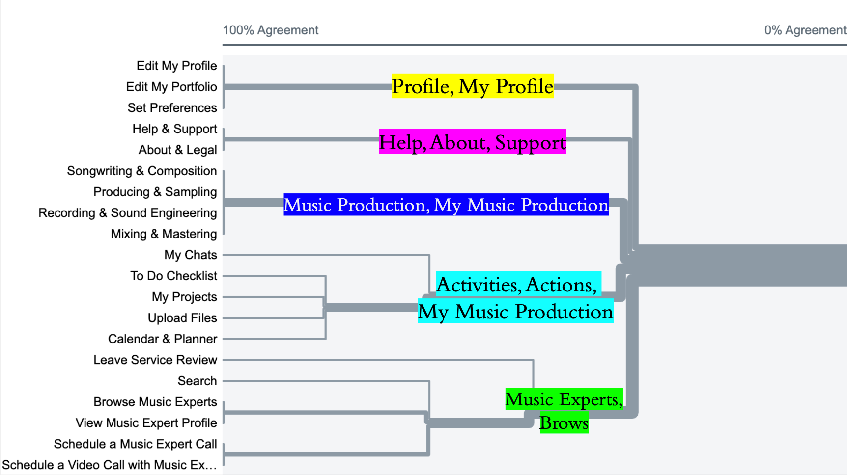
Secondly, I looked at the best merge dendrogram, which helped me to determine not just the best and most common grouping of cards and topics (several even reached 100 % agreement), but also what the most common categories of those groupings are. This made it much easier to update the number of categories as well as their names in my sitemap to a more cohesive layout.
On the left you can see the dendrogram with the most commonly used category titles.
This will be reflected on the next slide in my updated sitemap for ProdApp.
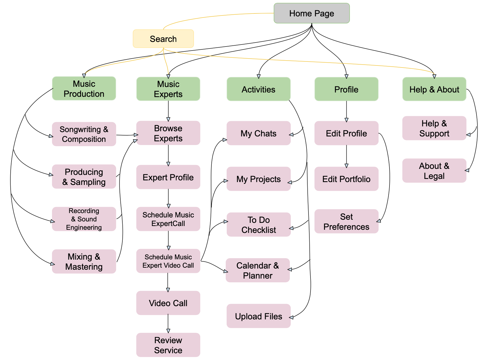
As the result of these findings, I developed the following, data driven initial sitemap for ProdApp:
Low Fidelity / Paper Wireframes:
With all the information gathered, I was prepared to create the first, hand drawn wireframes of the flows I and III:
User Flow I
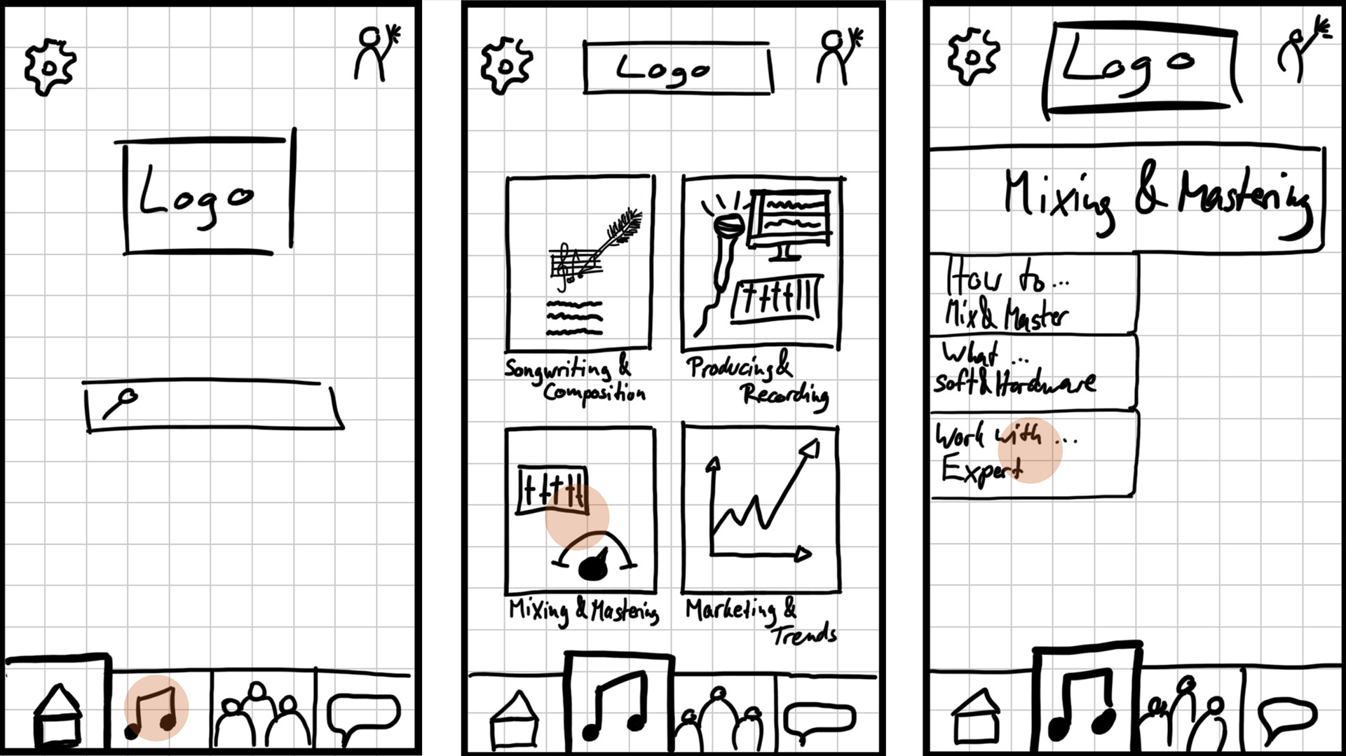
User Flow III
III. Prototype and Testing
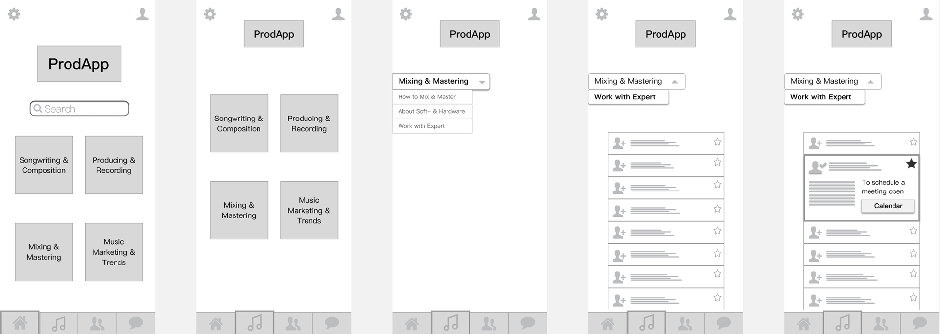
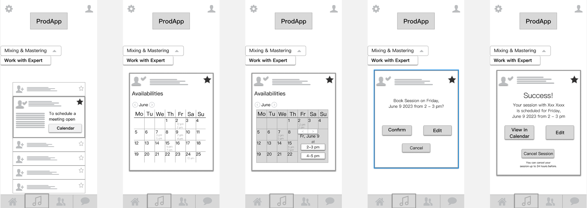
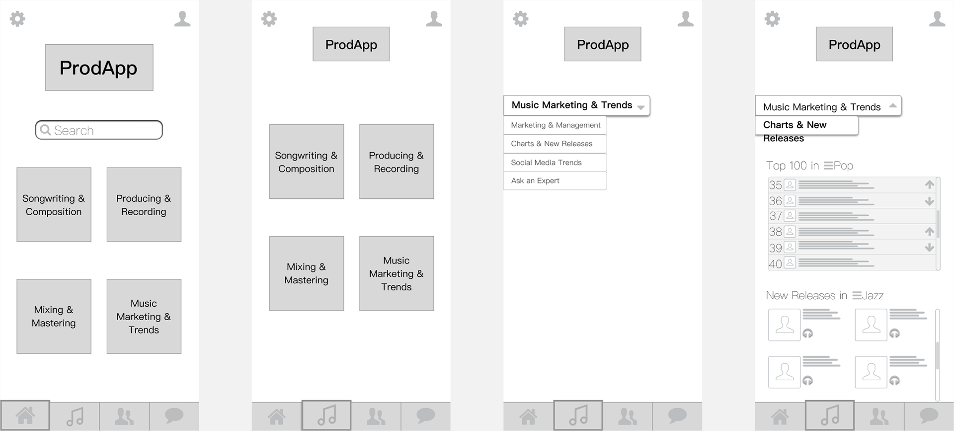
Medium Fidelity Wireframes:
In order to push this out and get it to be tested out in the form of an unmoderated usability test conducted worldwide, with five participants from the U.S, to Germany, to Indonesia, I created a simple and easily legible mid-fidelity grey scale version of these wireframe using Sketch and Figma, in order to create an interactive prototype.
User Flow I
To access the clickable prototype click here.
User Flow III
To access the clickable prototype click here.
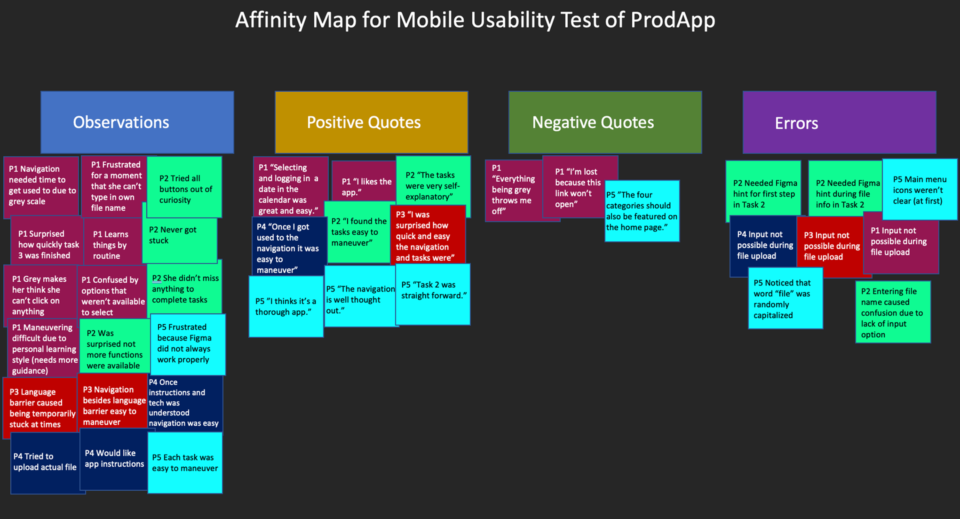
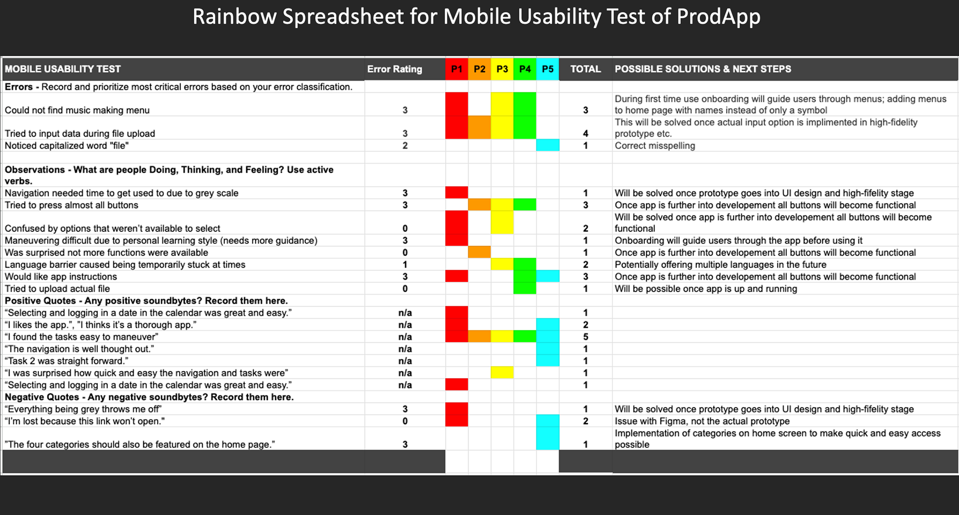
Some findings from the usability testing conducted using these mid-fidelity prototypes:
IV. The Final Design
After conducting usability testing and analyzing the collected data by using affinity mapping and the rainbow spreadsheet methods, I was able to work out a high fidelity prototype of the app. I furthermore incorporated accessibility guidelines in order to achieve a comprehensive and clear experience of ProdApp.
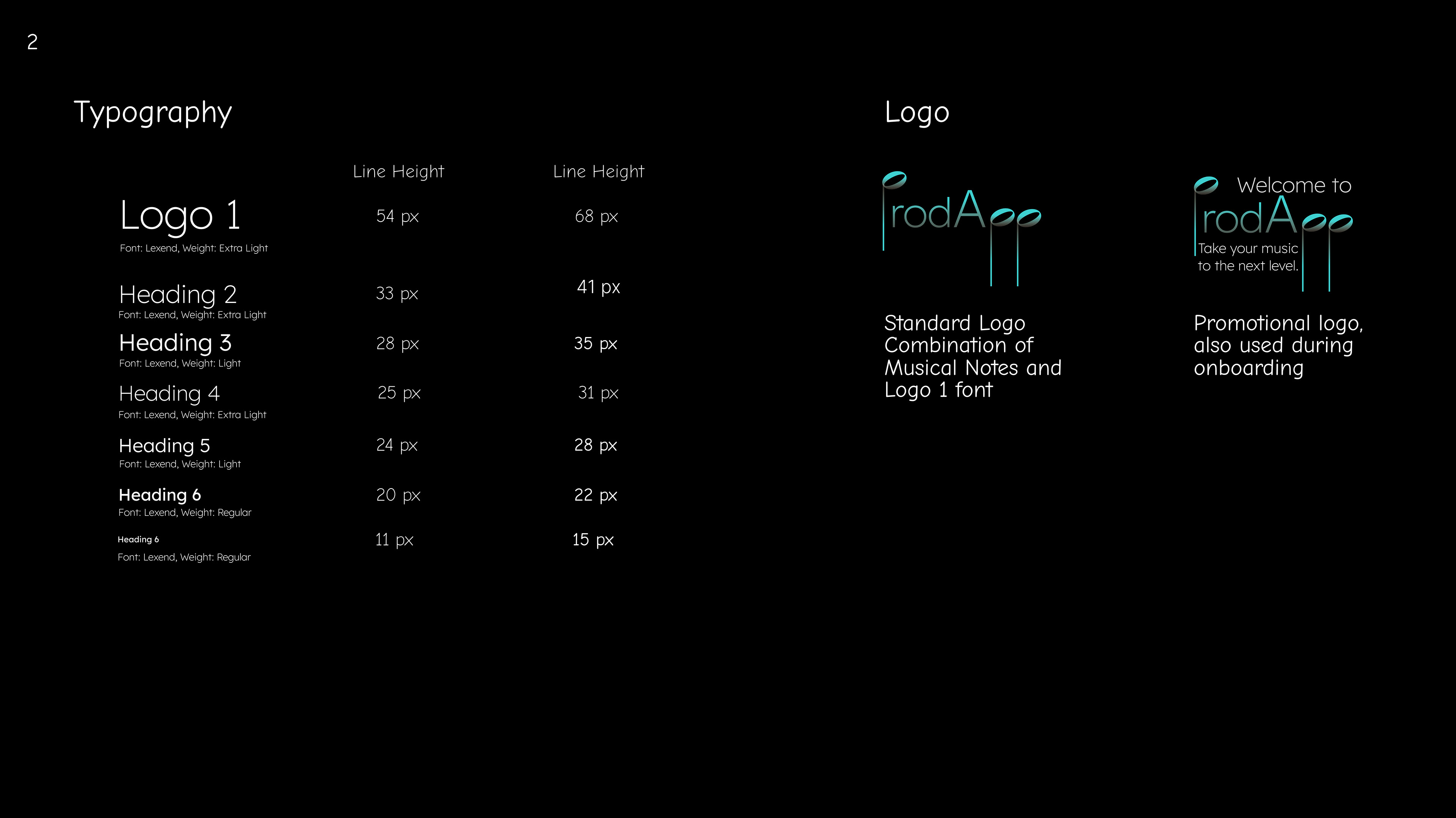
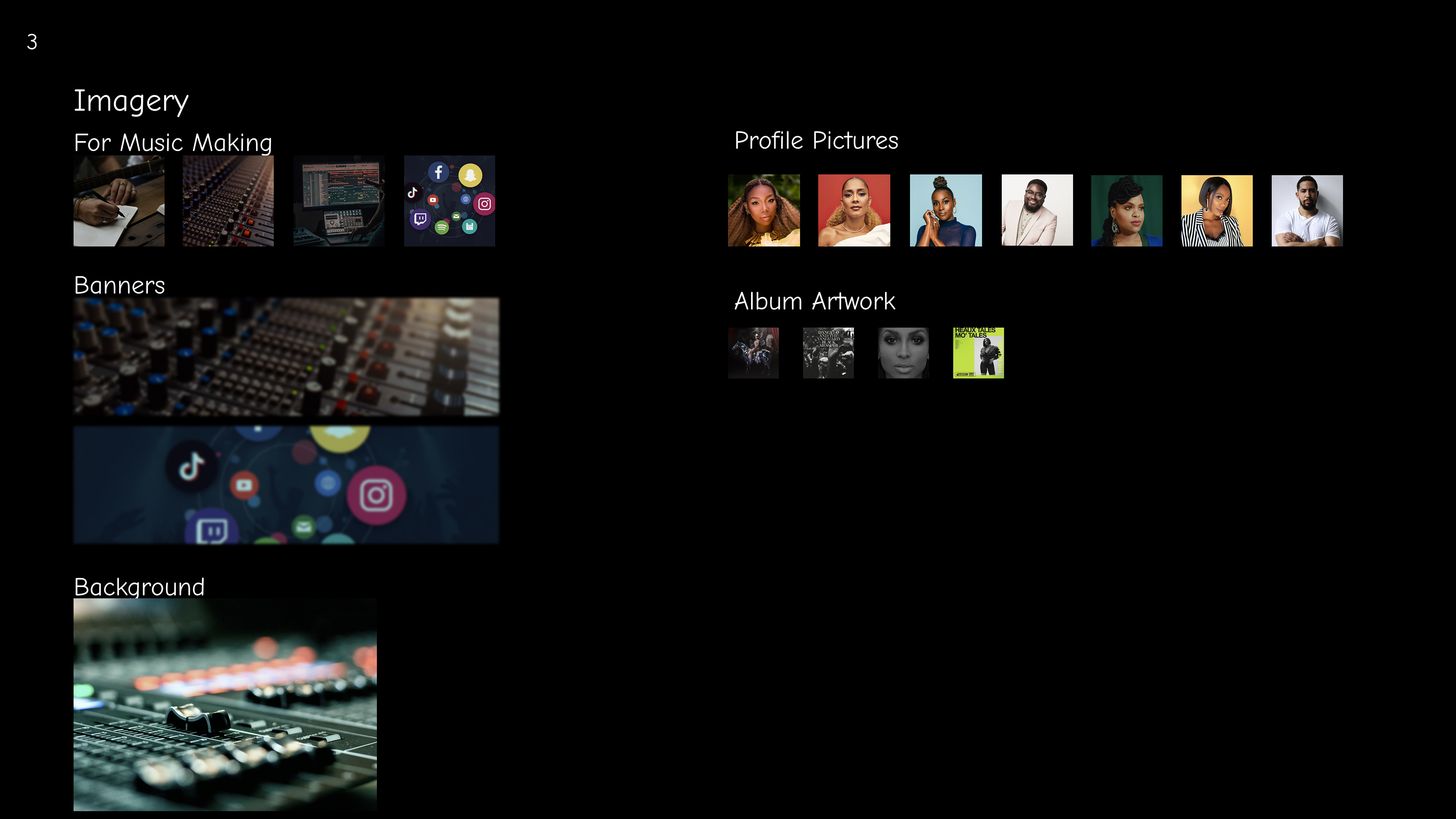
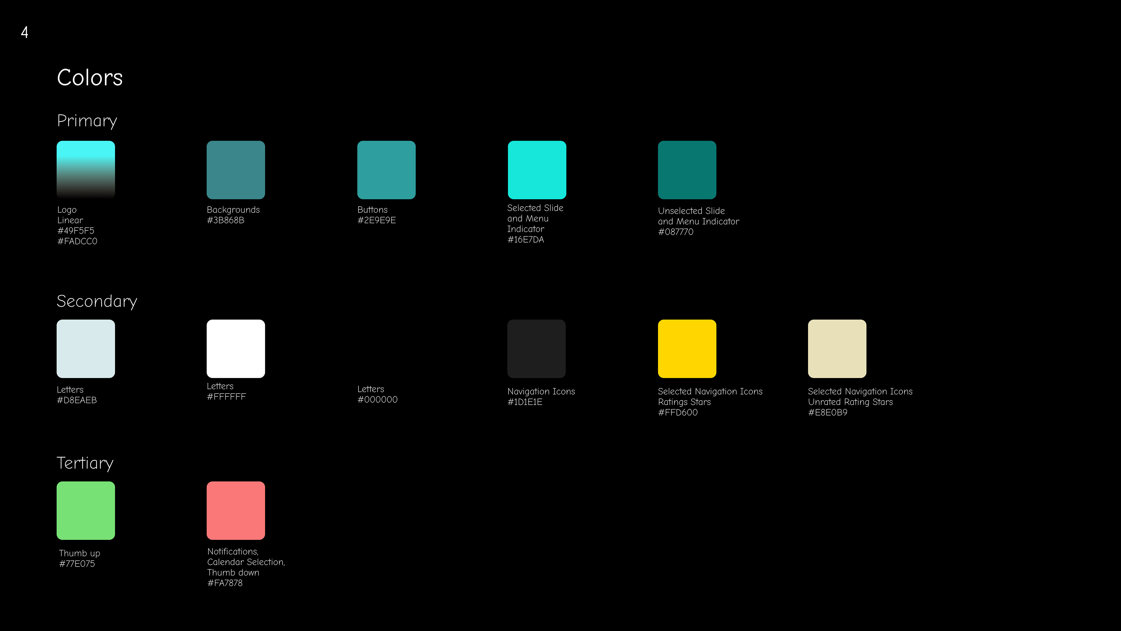
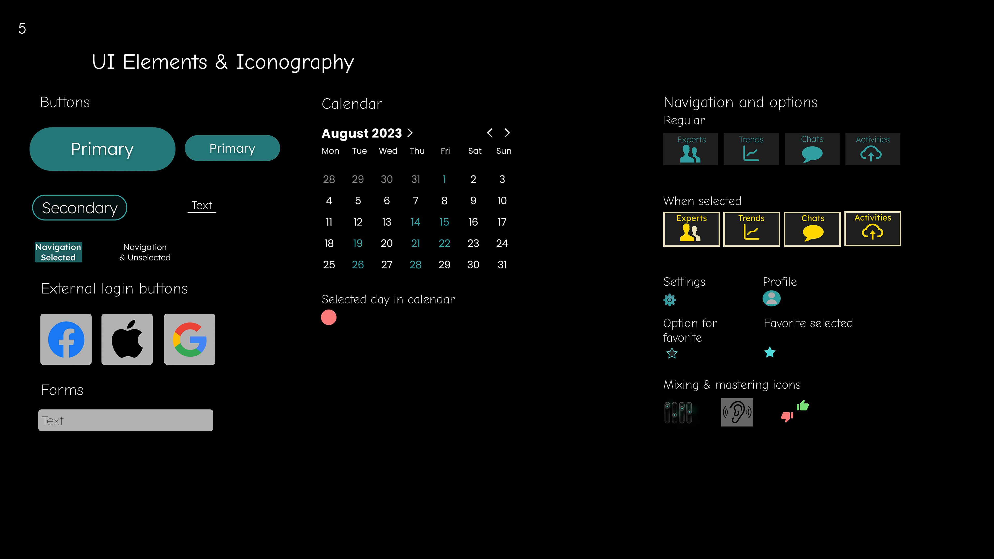
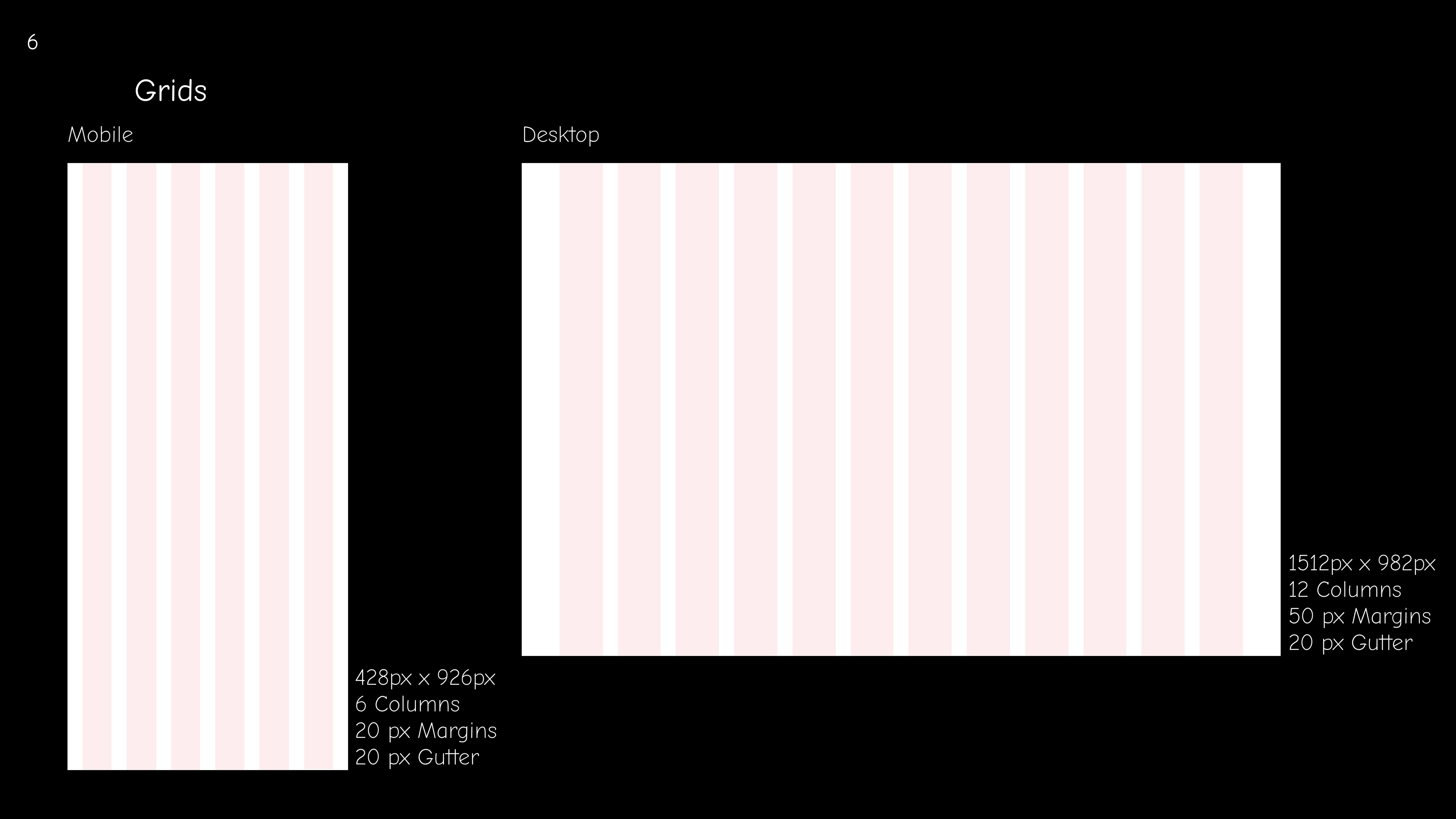
Style Guide
For the final design I created the following style guide including all relevant elements:
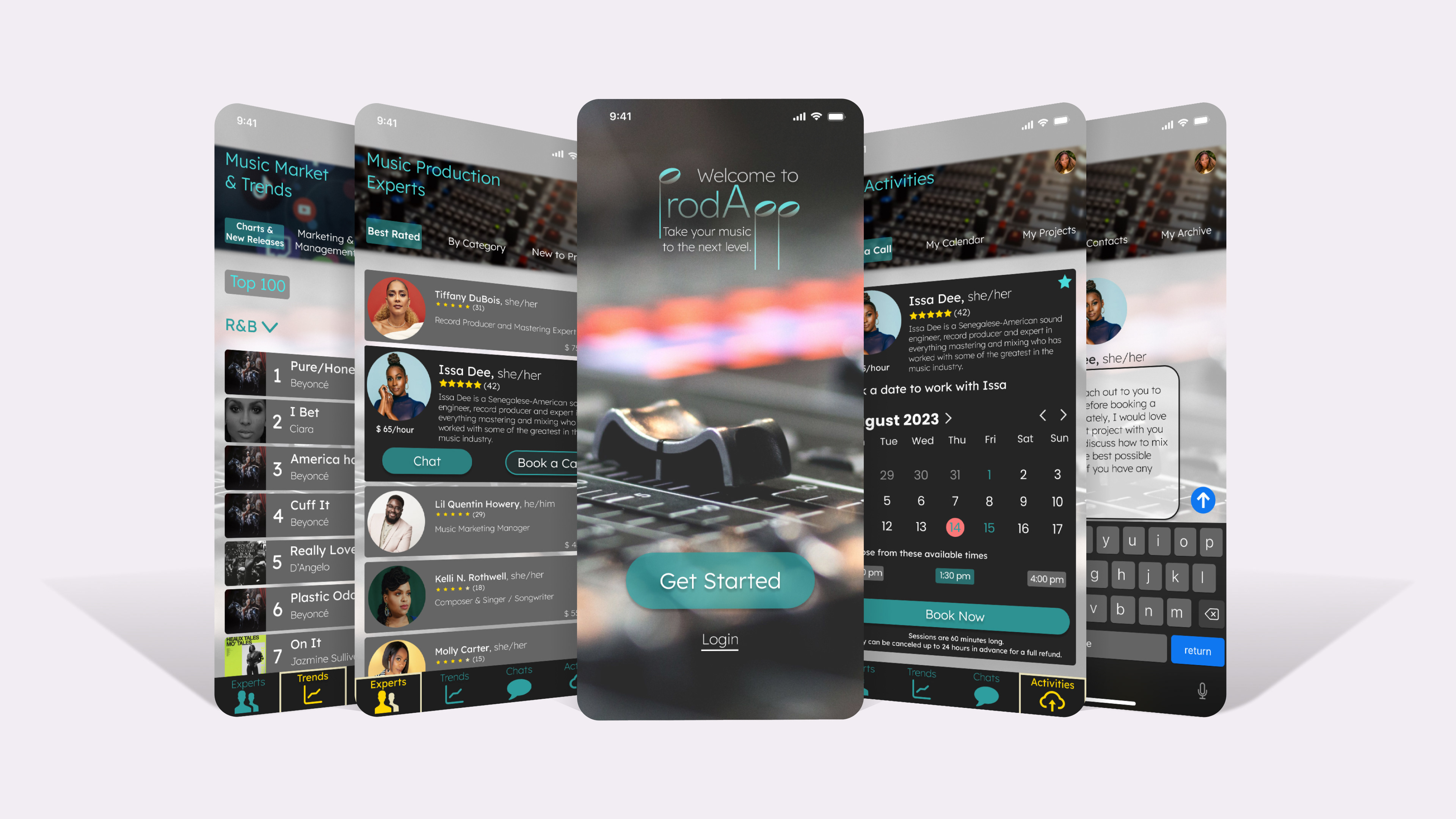
High Fidelity Mockup:
To access the clickable prototype click here.
This is the final mockup version of the new music making support app ProdApp. It is only a step in the journey of this experience. I strive to constantly improve my designs in order to match the users' needs and create a comprehensive and cohesive experience with my products.
Thank you for letting me walk you through my design process of ProdApp.
Cheers!
JGR - they / them